E-cycle Bin
E-cycle Bin is a mobile app designed to simplyfy e-waste recycling by providing users with clear location, pickup, and drop-off options in a seamless, intuitive experience.

E-cycle Bin is a mobile app designed to simplyfy e-waste recycling by providing users with clear location, pickup, and drop-off options in a seamless, intuitive experience.
Despite over 50 million tons of e-waste generated annually, many users don't recycle because the process is confusing or inconvenient. E-Cycle Bin aims to close that gap by reducing friction in disposal.

Illustration by William Tan
Our project centered on user experience, prompting the team to focus on designing an application that could simplify the intricate process of recycling e-waste.
We conducted 5 user interviews and collected 22 survey responses. Key insights included -"I didn't know where to take old devices."- -"pick up is more convienient than drop-off"- and -"It is unclear what is considered 'e-waste'"- A consistent theme emerged: users were neglecting to recycle their old electronic waste due to a lack of knowledge regarding how and where to do so. This highlighted a crucial gap in information accessibility and underscored the need for an intuitive and user-friendly solution to guide individuals in responsibly disposing of their electronic devices.

Showing off our own collections of e-waste
Armed with the insights garnered from our research, we crafted a compelling user persona named George. George is a 35-year-old IT engineer whose motivation is environmental resposibility, but he is time-constrained and dislikes logistical hassel. His biggest obstacles: location uncerntainty, scheduling, and prep steps for disposal.
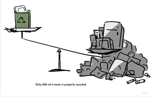
Illustration by William Tan
Subsequently, the team developed a user journey map to visually depict George's challenges, offering valuable guidance on where our design should focus to enhance the overall user experience.

User Journey Map
During our competitor analysis, we identified a notable gap in the market—few apps provided comprehensive start-to-finish services for e-waste recycling at the time of this design. Motivated by the goal of addressing major challenges in e-waste recycling for users like George, our team set out to create an application that would serve as a holistic solution. Employing a feature prioritization matrix, we strategically determined which features would yield the most significant impact while maintaining a realistic project scope.

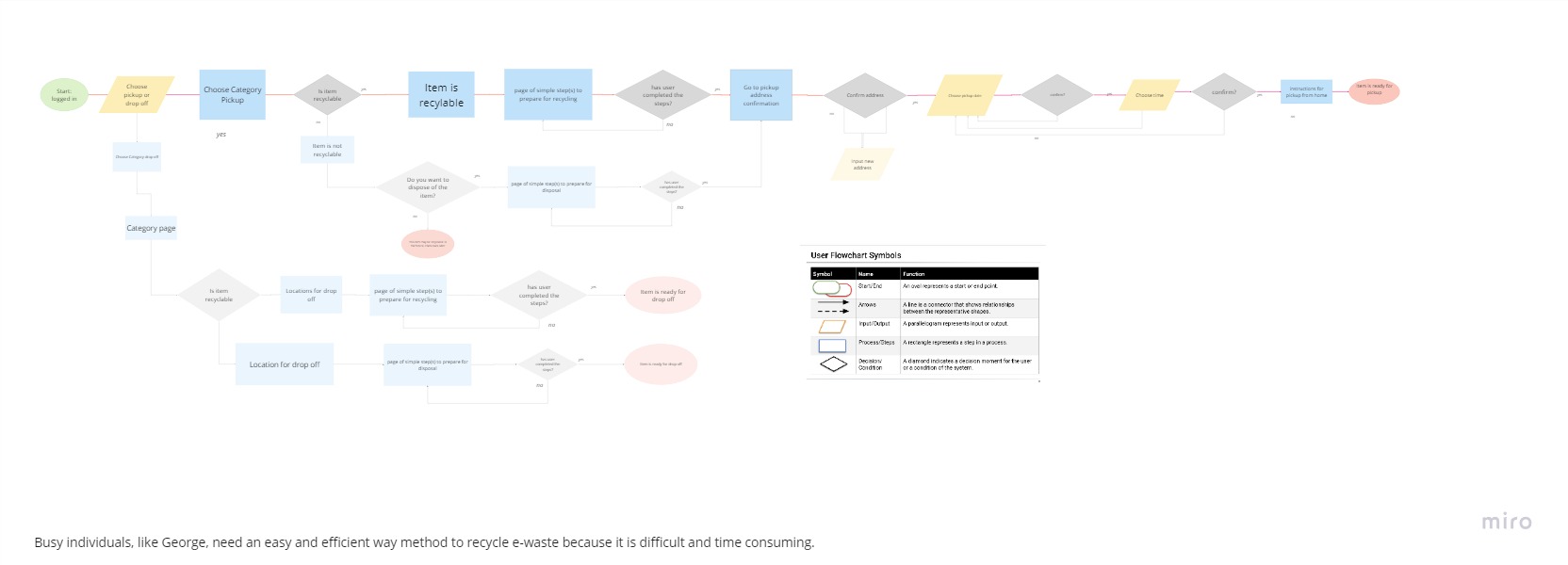
User Flow
This user flow commences post-login, with George initiating the process by selecting the category of the item he wishes to recycle. Subsequently, the system prompts him to decide whether he prefers a home pickup or if he would rather drop off the item at a recycling facility. The primary route focuses on home pickups, progressing to steps that involve checking if the item requires special treatment (e.g., removing batteries, cords, etc.). Once these criteria are satisfied, users can proceed to schedule a pickup date and time. After confirming the appointment, users receive detailed information about the pickup, and the item is readied for collection.
In the alternative route, designed for those opting to drop off their e-waste, users are presented with a list of nearby locations to choose from. This thoughtful user experience design ensures a seamless and tailored process for users, accommodating their preferences for recycling and contributing to a more sustainable and user-friendly solution.

Landing page wireframe

Recycling Bin wireframe

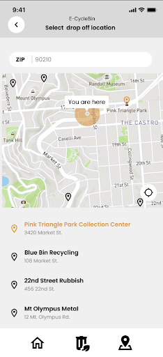
Map wireframe
Progressing into the realm of low-fidelity wireframe app design, our objective was to establish a user-friendly flow. We aimed to offer users like George the flexibility to search either by location or categories, providing convenient options for drop-off locations or home pickup services, thereby ensuring an easy and efficient recycling experience. Subsequently, we conducted prototype testing with four participants on Figma, setting specific goals for the testers and meticulously observing their interactions to gather insights. The feedback revealed positive reception toward the map feature and overall app accessibility. However, users expressed a desire for a more straightforward "home" route and identified occasional navigation confusion as an area for improvement.

prototype
Based on the feedback received, a significant revision in our user flow post-testing is the prioritization of the choice between pickup and drop-off options. This adjustment enables users to promptly determine their preferred method of e-waste disposal. Once this decision is made, the user is seamlessly directed to the categories page, where the flow aligns with the previous process—allowing them to choose drop-off locations or schedule pickup dates and times.
Post Testing User Flow
We incorporated a bottom navigation bar across pages and integrated a list of drop-off locations onto the map. On the Category page, the top search bar was omitted as all recyclables are systematically organized by categories, eliminating the need for the search bar. The "Old Electronics" category was replaced with the "Other" category tab, enhancing visual clarity with the addition of icons for intuitive navigation.

Categories wireframe
Updated map wireframe
In conclusion, the E-Cycle Bin project has been a journey of innovation and user-centric design. From identifying a critical gap in the market through competitor analysis to fine-tuning the user flow based on comprehensive testing and feedback, every step was aimed at creating an application that simplifies and enhances the e-waste recycling experience.
The prioritization of features, adjustments in the user flow, and refinements in visual design all culminated in a comprehensive solution catering to users like George, providing them with an efficient and sustainable approach to managing their electronic waste. The addition of features like the bottom navigation bar and the integration of drop-off locations on the map contribute to a more seamless and user-friendly experience, addressing the initial challenges identified in user interviews and surveys.
This project has been a valuable learning experience, expanding my understanding of user experience design. Navigating the iterative process, from low-fidelity wireframes to prototype testing and subsequent refinements, has honed my skills in designing intuitive and effective digital solutions. The insights gained from user feedback have underscored the importance of constant refinement and adaptation in the design process.
As I move forward, these lessons will undoubtedly inform and enrich my future endeavors in creating user-centered and impactful digital experiences.